Best Guide for Color Theory in Wedding Photography
Color theory in wedding photography helps brides design a cohesive look by harmonizing tones across décor, attire, lighting, and editing. The right color palette sets the emotional tone of your wedding, from romantic pastels to moody jewel hues, and ensures your photos feel timeless and connected. Understanding how colors interact can elevate your entire visual story, both in person and on camera.
Why Color Theory Matters for Your Wedding Photos
Color theory isn’t just for artists. It’s a key part of wedding design and photography. It influences how your photos feel and how well every detail fits together. A balanced color palette ensures that your flowers, bridesmaid dresses, décor, and even your backdrop create visual harmony.
When colors clash or lack coordination, your photos can appear unbalanced or overly busy. But when colors complement each other, your wedding looks polished, intentional, and deeply personal.
The Psychology of Color: Setting the Mood
Colors evoke emotions and your wedding palette communicates your story before a single photo is taken. Here’s how common wedding tones influence mood:
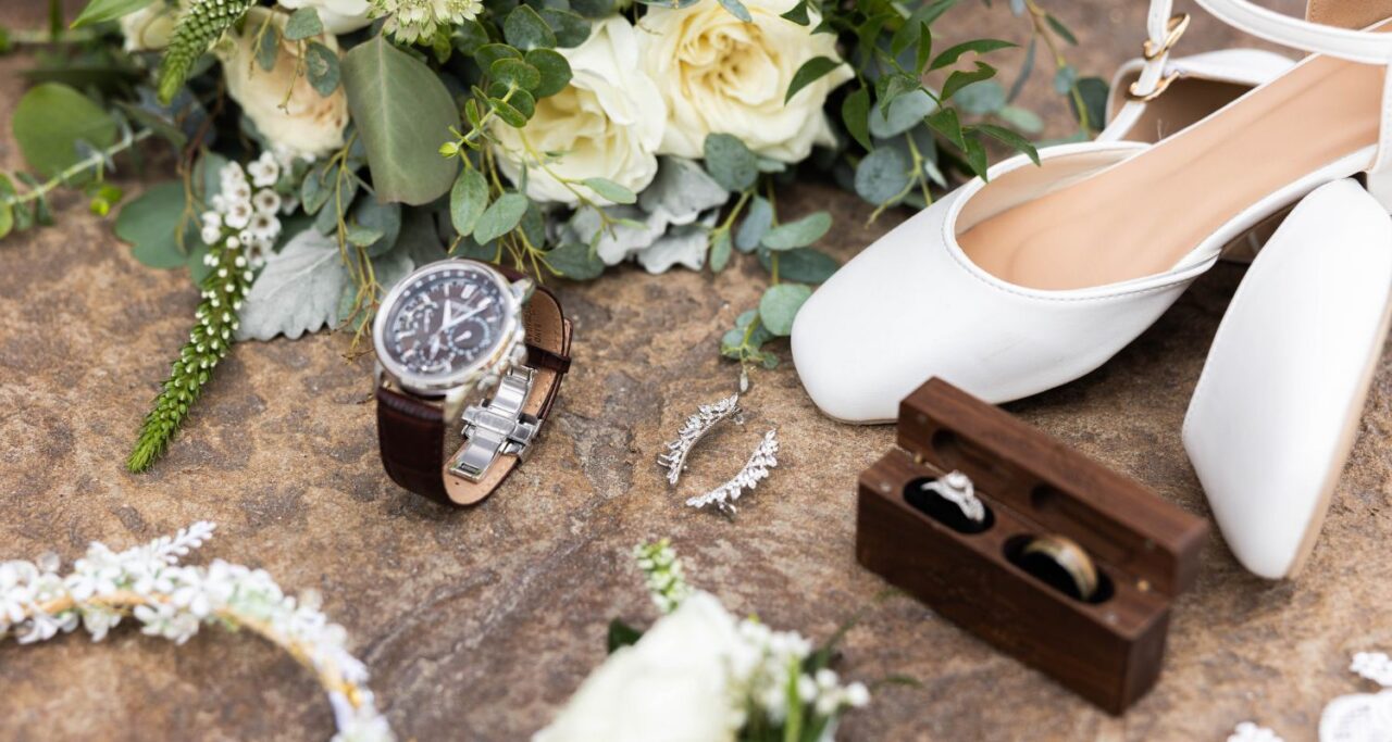
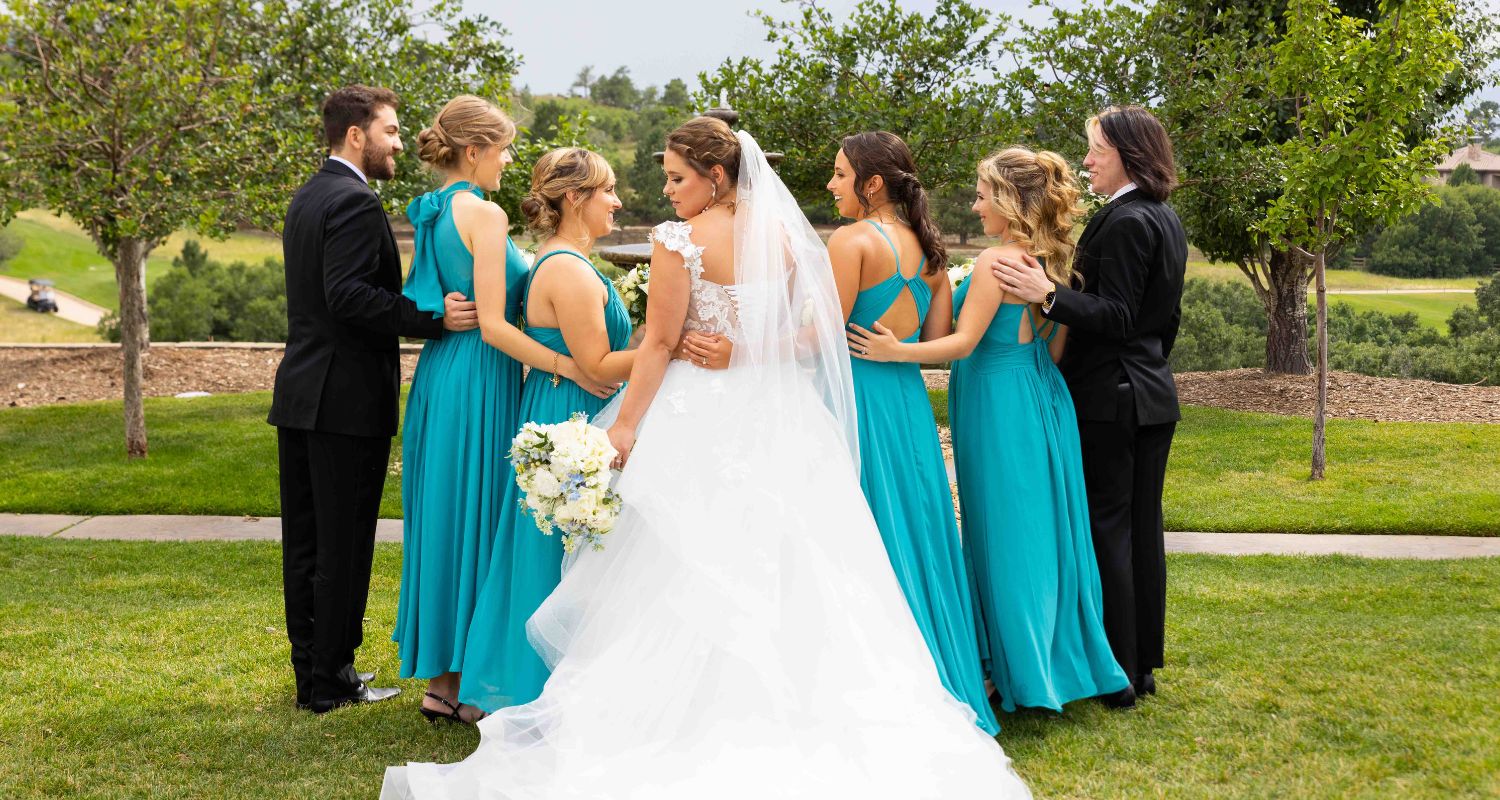
- White & Ivory: Classic, pure, and timeless. Often paired with greenery for a clean and elegant aesthetic.
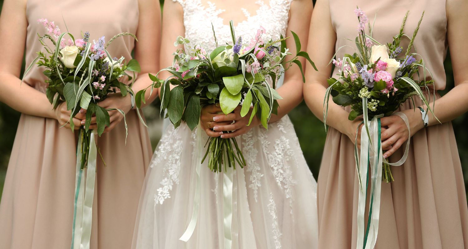
- Blush & Pastels: Romantic, soft, and whimsical. Perfect for garden or spring weddings.
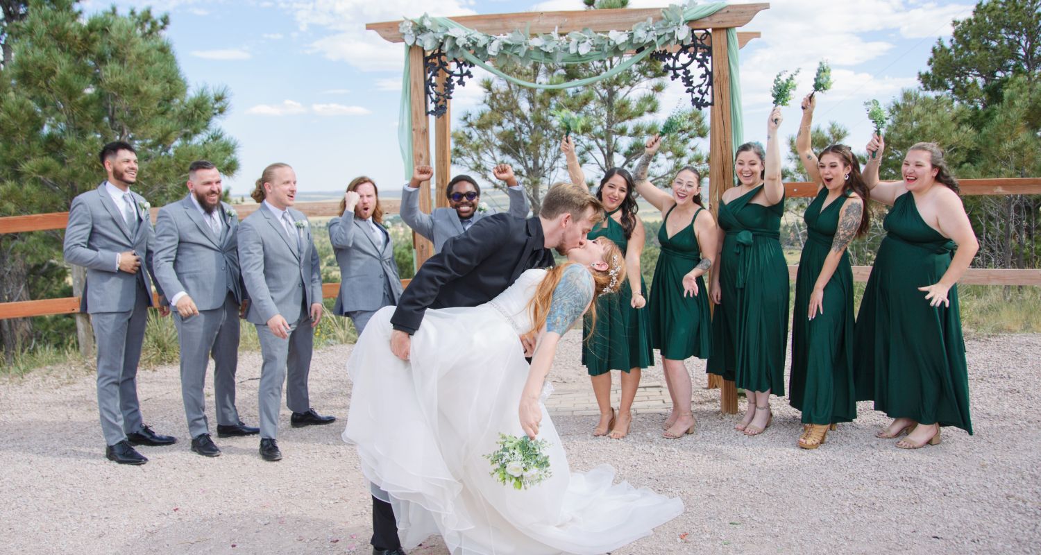
- Navy & Burgundy: Bold and regal, often used for fall or winter weddings to add warmth and depth.
- Sage & Neutrals: Modern, minimalist, and calming. Excellent for outdoor or boho celebrations.
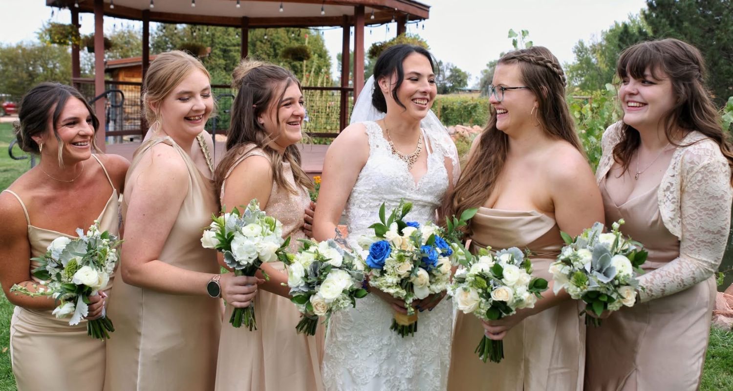
- Gold & Champagne: Luxurious, elegant, and radiant. Ideal for formal or evening weddings.
Tip: Before finalizing your palette, think about the feeling you want your wedding to convey. Do you want soft and dreamy or vibrant and dramatic?
How Color Theory Shapes Wedding Photography
Photographers use color theory to bring balance and story to every image. The color of your venue, lighting, and wardrobe can all affect how your photos turn out.
Here’s how photographers apply color theory:
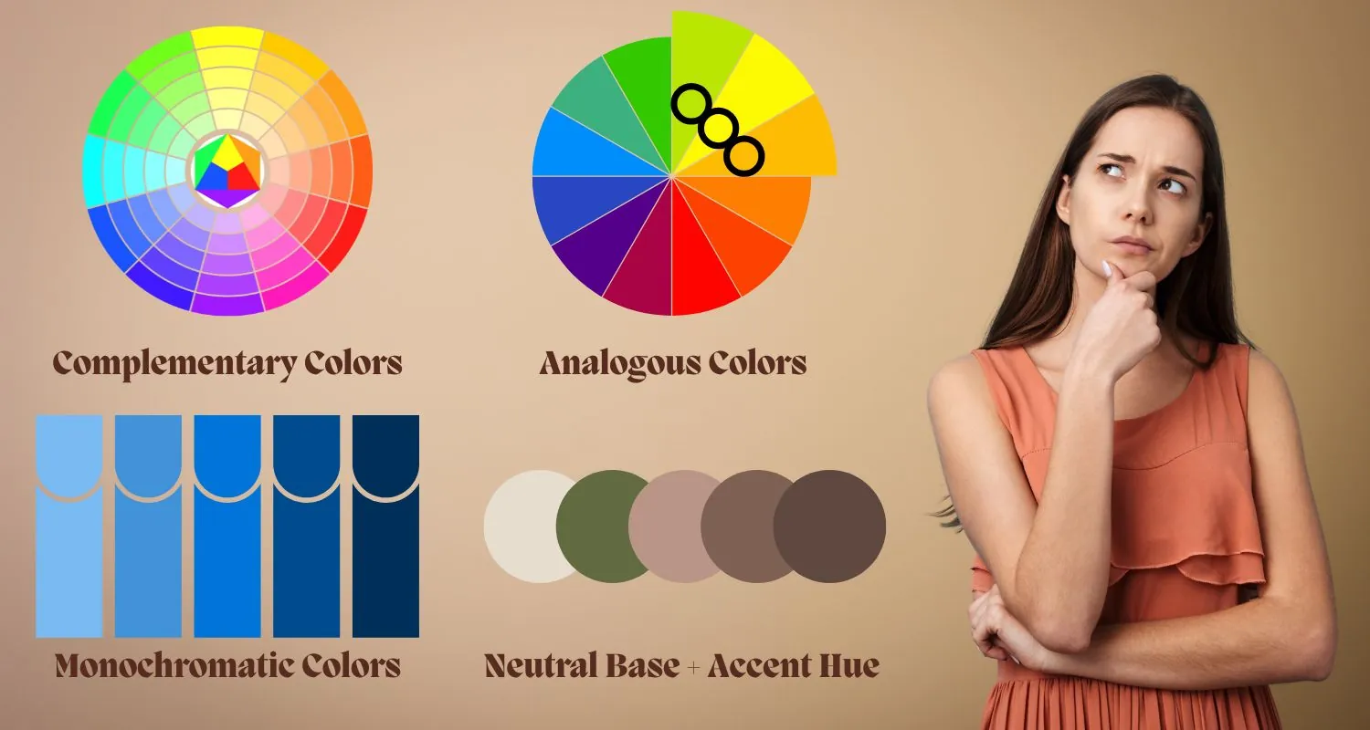
- Complementary Colors (opposites on the color wheel, like blue and orange) create dynamic contrast and visual pop.
- Analogous Colors (next to each other on the wheel, like pink and peach) create a soft, romantic harmony.
- Monochromatic Colors (different shades of the same hue) give a sleek, modern, and editorial look.
- Neutral Base + Accent Hue helps your wedding look refined while letting one color stand out for personality.
By coordinating your color palette with your Colorado Springs wedding photographer, you help them tell a seamless visual story, one where every photo connects to the next.
How to Choose the Right Palette for Your Wedding
When selecting your colors, keep these factors in mind:
- Venue Lighting & Background:
Natural light venues complement pastel and earthy tones. Indoor or low-light venues work well with bold, rich colors. - Seasonal Influence:
- Spring: Blush, lavender, mint
- Summer: Coral, turquoise, gold
- Fall: Terracotta, plum, mustard
- Winter: Emerald, navy, silver
- Your Dress & Décor:
Choose colors that enhance your attire and blend naturally with your floral arrangements and table settings. - Photography Style:
If your photographer favors light and airy editing, go for pastels and soft neutrals. For moody and cinematic styles, choose deeper tones like burgundy or forest green.
Common Mistakes Brides Make (and How to Avoid Them)
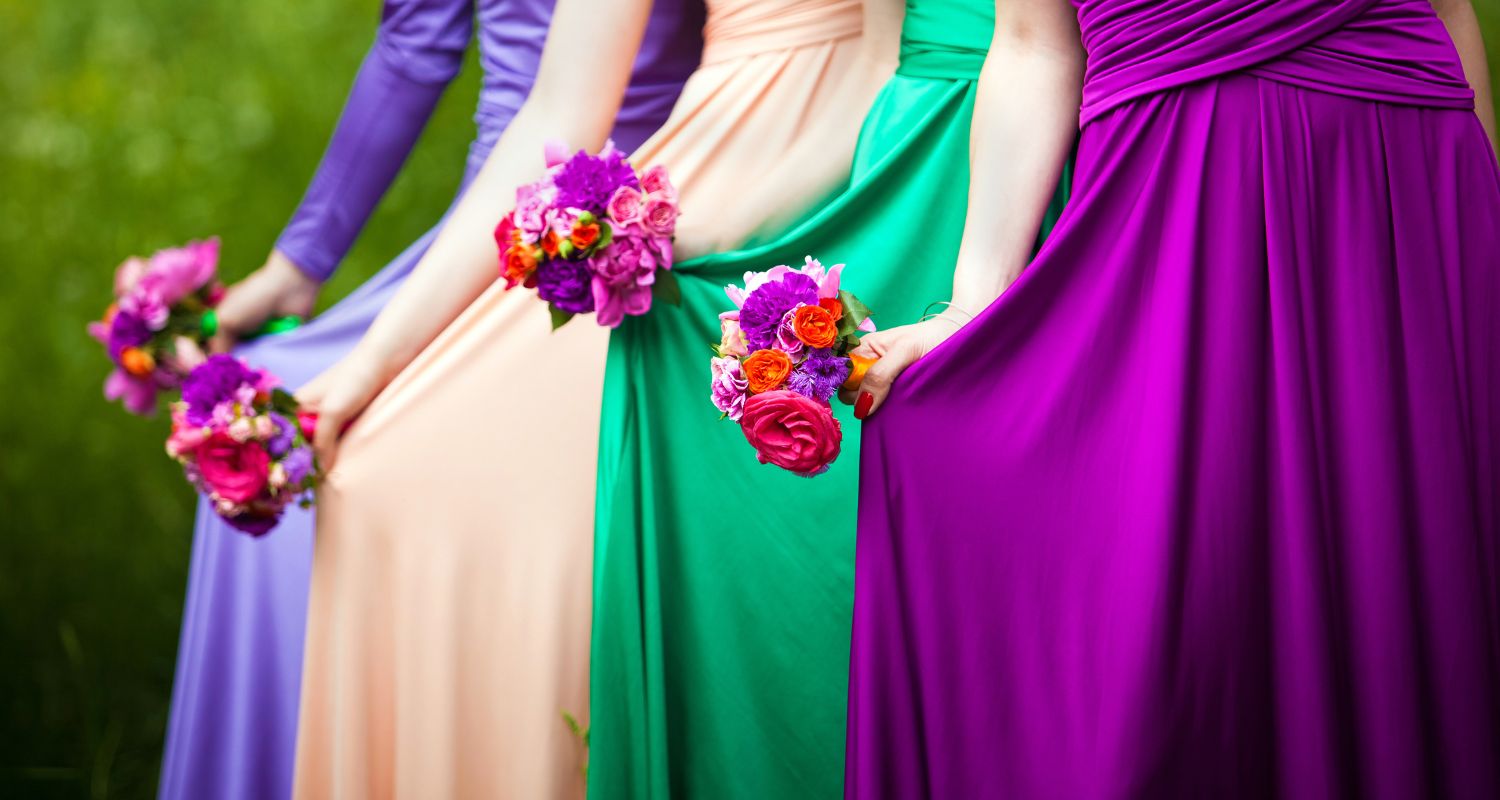
- Too Many Colors: Stick to 3-4 main tones to avoid visual clutter.
- Ignoring Lighting Conditions: Some colors may look dull indoors but vibrant in sunlight.
- Not Consulting Your Photographer: They know how different shades translate in camera and can guide your choices.
- Overlooking Skin Tones: Ensure your chosen palette flatters both you and your bridal party in photos.
FAQs
Q: How does color affect the outcome of wedding photos?
A: Colors influence light reflection and contrast. Warm tones make photos feel cozy, while cool tones create elegance and calmness.
Q: Should my wedding colors match my photography style?
A: Yes. Aligning your palette with your photographer’s editing style helps create consistency and visual storytelling.
Q: How many colors should I include in my palette?
A: The ideal range is 3-4 main tones with 1-2 accent hues. This keeps your design cohesive while allowing creative flexibility.
Q: Can color theory help with indoor weddings?
A: Absolutely. Soft neutrals balance artificial lighting, while darker tones add richness under dim or candlelit settings.
Let’s Capture Your Dream Palette
At Complete Weddings + Events Colorado Springs, we believe your wedding colors should do more than look pretty, they should tell your story. Our team helps you create a cohesive look that aligns with your color palette, ensuring every image reflects your vision.
Let’s bring your wedding colors to life. Inquire today for a custom quote!