Best Guide for Color Theory in Wedding Photography

Color theory in wedding photography helps create a seamless, visually stunning celebration by blending tones in décor, outfits, lighting, and photo editing. The colors you choose influence the overall mood and tie every detail together. Knowing how different shades work in harmony can make your photos feel both cohesive and timeless.
Why Color Theory Matters for Your Wedding Photos
Color theory goes beyond art. It’s essential for creating stunning, cohesive wedding photos. It shapes the mood of your images and ensures that every element, from the flowers to the décor, works beautifully together.
When your palette is well-balanced, your photos feel elegant and thoughtfully designed. But when colors compete or don’t flow, the overall look can feel chaotic. Choosing complementary hues makes your wedding visuals feel seamless, refined, and uniquely yours.
The Psychology of Color: Setting the Mood
Colors evoke emotions and your wedding palette communicates your story before a single photo is taken. Here’s how common wedding tones influence mood:
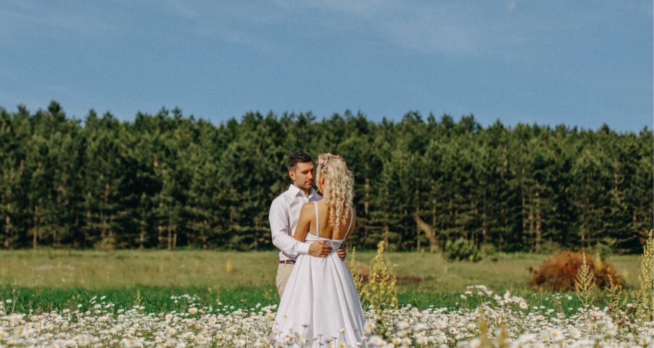
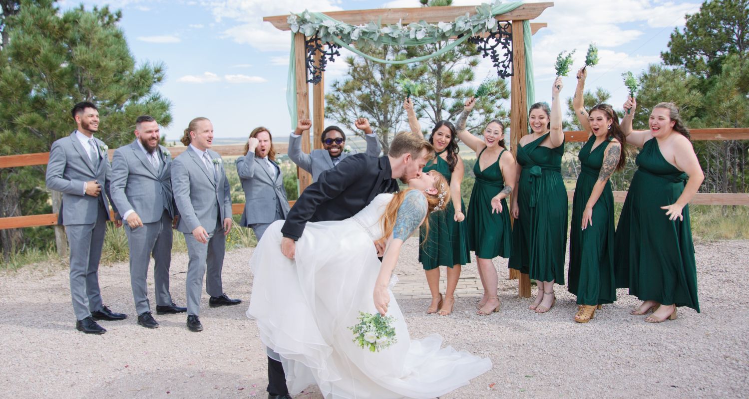
- White & Ivory: Timeless and pure. Perfect for a refined, elegant look when paired with lush greenery.
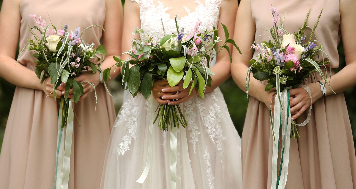
- Blush & Pastels: Gentle, romantic, and dreamy. Ideal for springtime or garden weddings.
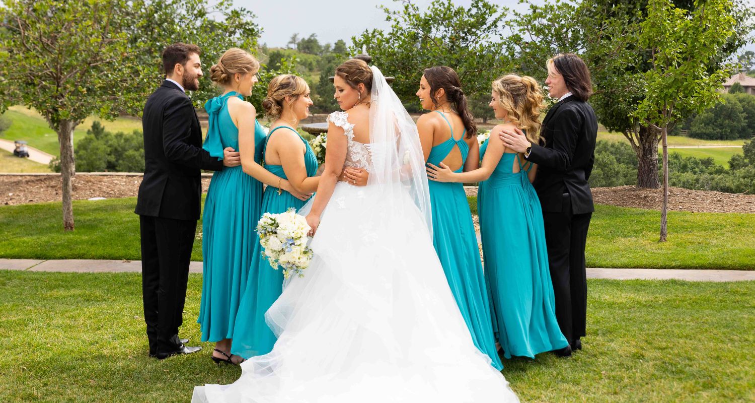
- Navy & Burgundy: Rich, bold, and dramatic. Adds warmth and sophistication to fall or winter celebrations.
- Sage & Neutrals: Calming, modern, and effortlessly chic. Great for boho or outdoor settings.
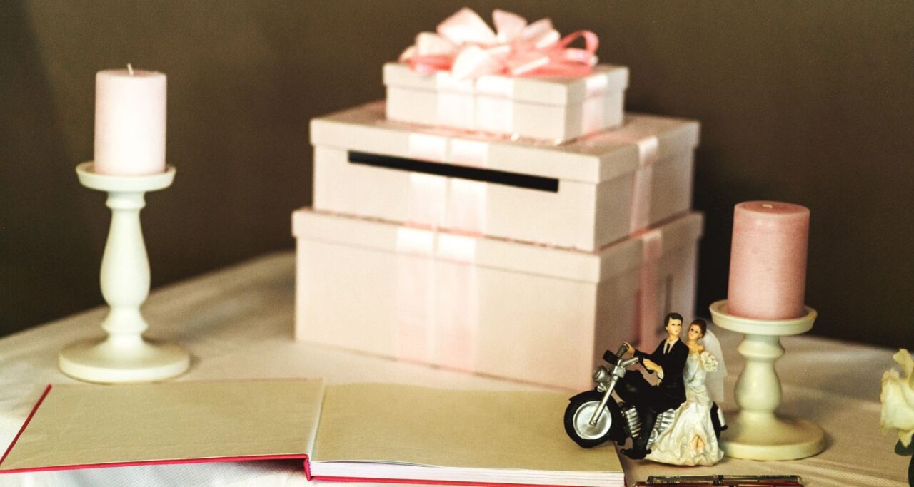
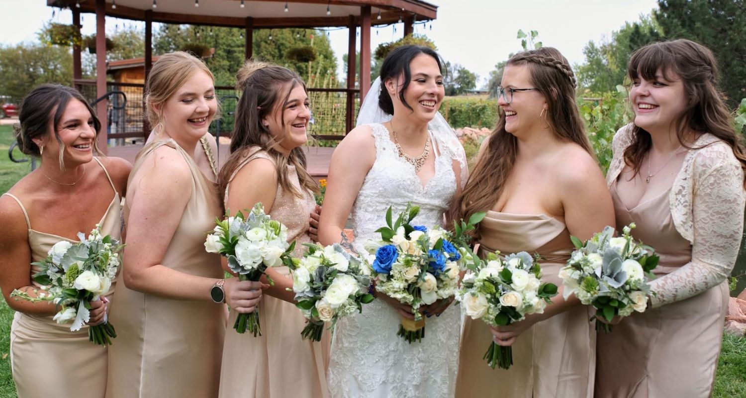
- Gold & Champagne: Glamorous and radiant. Perfect for formal or evening affairs.
Pro Tip: Before choosing your colors, ask yourself what kind of emotion you want your wedding to express. Soft and romantic or bold and statement-making?
How Color Theory Shapes Wedding Photography
Photographers use color theory to bring balance and story to every image. The color of your venue, lighting, and wardrobe can all affect how your photos turn out.
Here’s how photographers apply color theory:
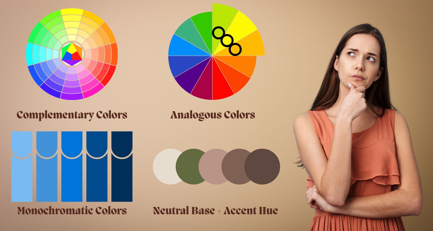
- Complementary Colors (opposites on the color wheel, like blue and orange) create dynamic contrast and visual pop.
- Analogous Colors (next to each other on the wheel, like pink and peach) create a soft, romantic harmony.
- Monochromatic Colors (different shades of the same hue) give a sleek, modern, and editorial look.
- Neutral Base + Accent Hue helps your wedding look refined while letting one color stand out for personality.
By coordinating your color palette with your Northern Colorado wedding photographer, you help them tell a seamless visual story, one where every photo connects to the next.
How to Pick the Perfect Wedding Color Palette
Choosing your wedding colors goes beyond preference. It’s about balance, lighting, and the overall mood you want to create. Here’s what to consider:
- Venue Lighting & Setting:
Outdoor spaces with natural light pair beautifully with soft, earthy hues, while indoor or dimly lit venues shine with bold and vibrant tones. - Seasonal Vibes:
Spring: Blush, lavender, mint
Summer: Coral, turquoise, gold
Fall: Terracotta, plum, mustard
Winter: Emerald, navy, silver - Dress & Décor Harmony:
Select shades that complement your gown, floral arrangements, and table styling for a cohesive aesthetic. - Photography Aesthetic:
Light and airy photographers bring out the best in pastels and neutrals, while cinematic or moody editors enhance rich, deep colors like burgundy, forest green, or navy.
Common Wedding Color Mistakes (and How to Avoid Them)
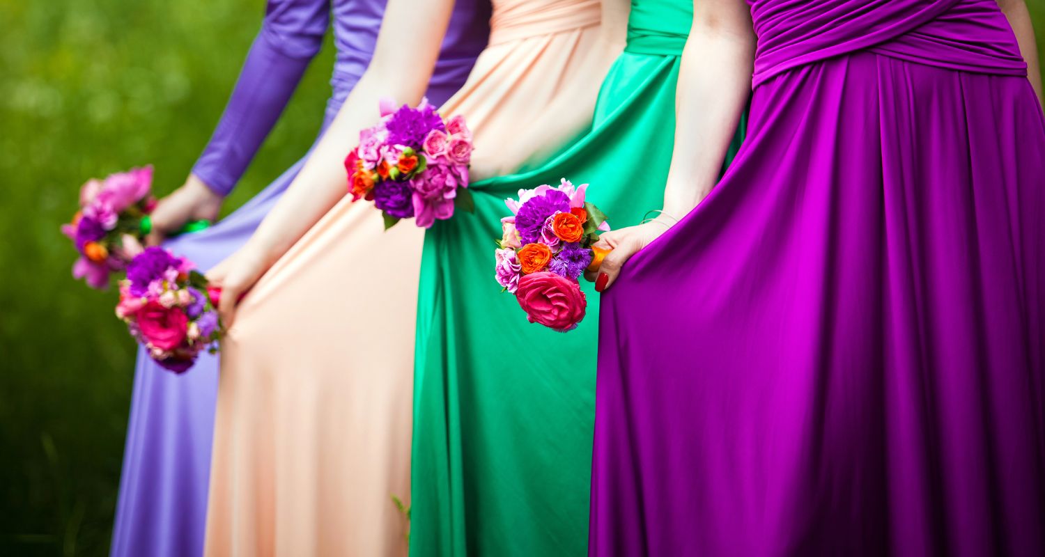
- Using Too Many Colors: Limit your palette to 3-4 main hues to keep your theme cohesive and visually appealing.
- Forgetting About Lighting: Colors can shift dramatically between indoor and outdoor settings. Test how your palette looks in different light.
- Not Asking Your Photographer: Your photographer understands how certain tones appear on camera and can help you pick colors that photograph beautifully.
- Overlooking Skin Tones: Choose shades that complement both you and your bridal party, so everyone glows in the photos.
FAQs
Q: How does color affect the outcome of wedding photos?
A: Colors influence light reflection and contrast. Warm tones make photos feel cozy, while cool tones create elegance and calmness.
Q: Should my wedding colors match my photography style?
A: Yes. Aligning your palette with your photographer’s editing style helps create consistency and visual storytelling.
Q: How many colors should I include in my palette?
A: The ideal range is 3-4 main tones with 1-2 accent hues. This keeps your design cohesive while allowing creative flexibility.
Q: Can color theory help with indoor weddings?
A: Absolutely. Soft neutrals balance artificial lighting, while darker tones add richness under dim or candlelit settings.
Let’s Capture Your Dream Palette
At Complete Weddings + Events Northern Colorado, we believe your wedding colors should do more than look pretty, they should tell your story. Our team helps you create a cohesive look that aligns with your color palette, ensuring every image reflects your vision.
Let’s bring your wedding colors to life. Inquire today for a custom quote!